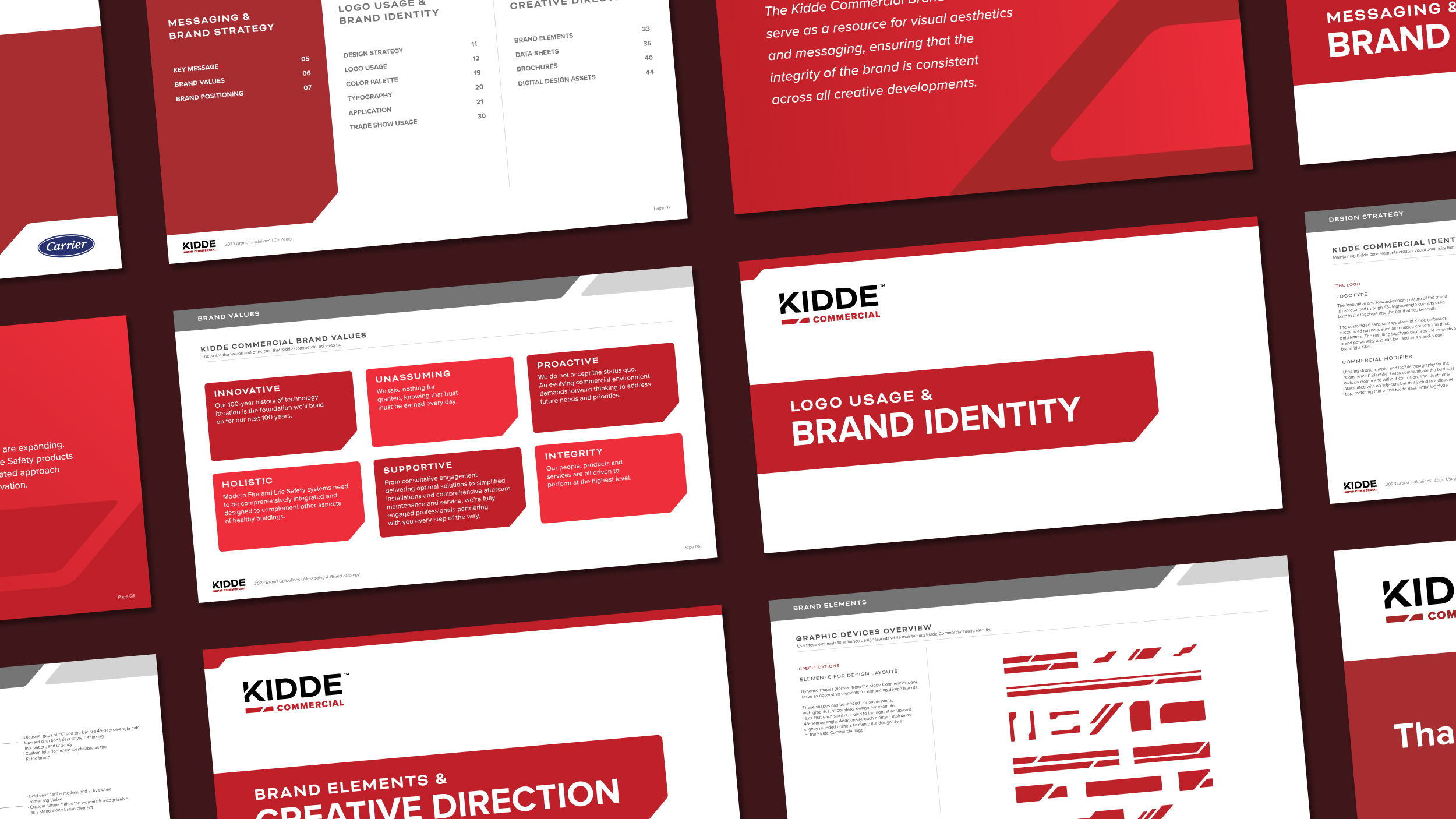
Logo & Logo Suite Design, Color Palette Exploration, Pattern & Supporting Graphic Devices, Brand Guidelines & Brand Books, Business Materials & Print Collateral
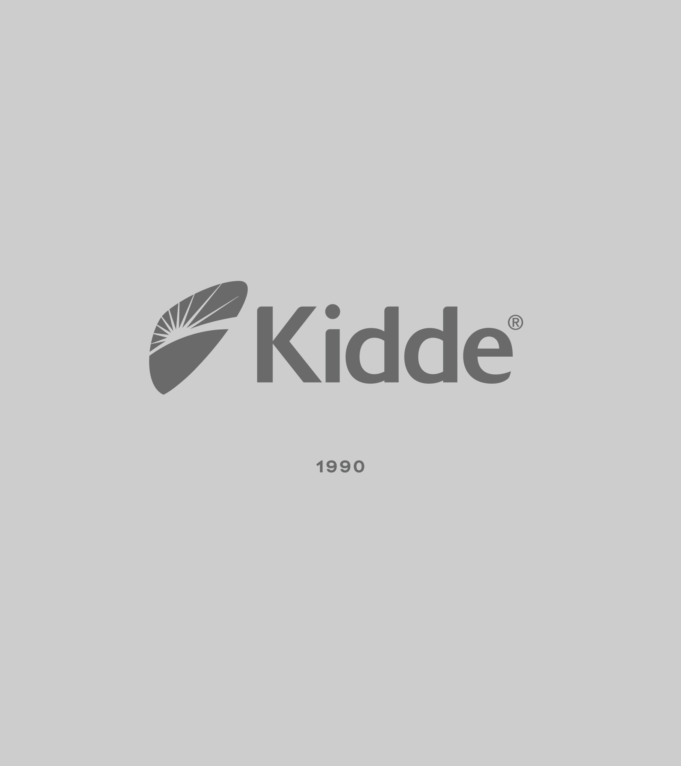
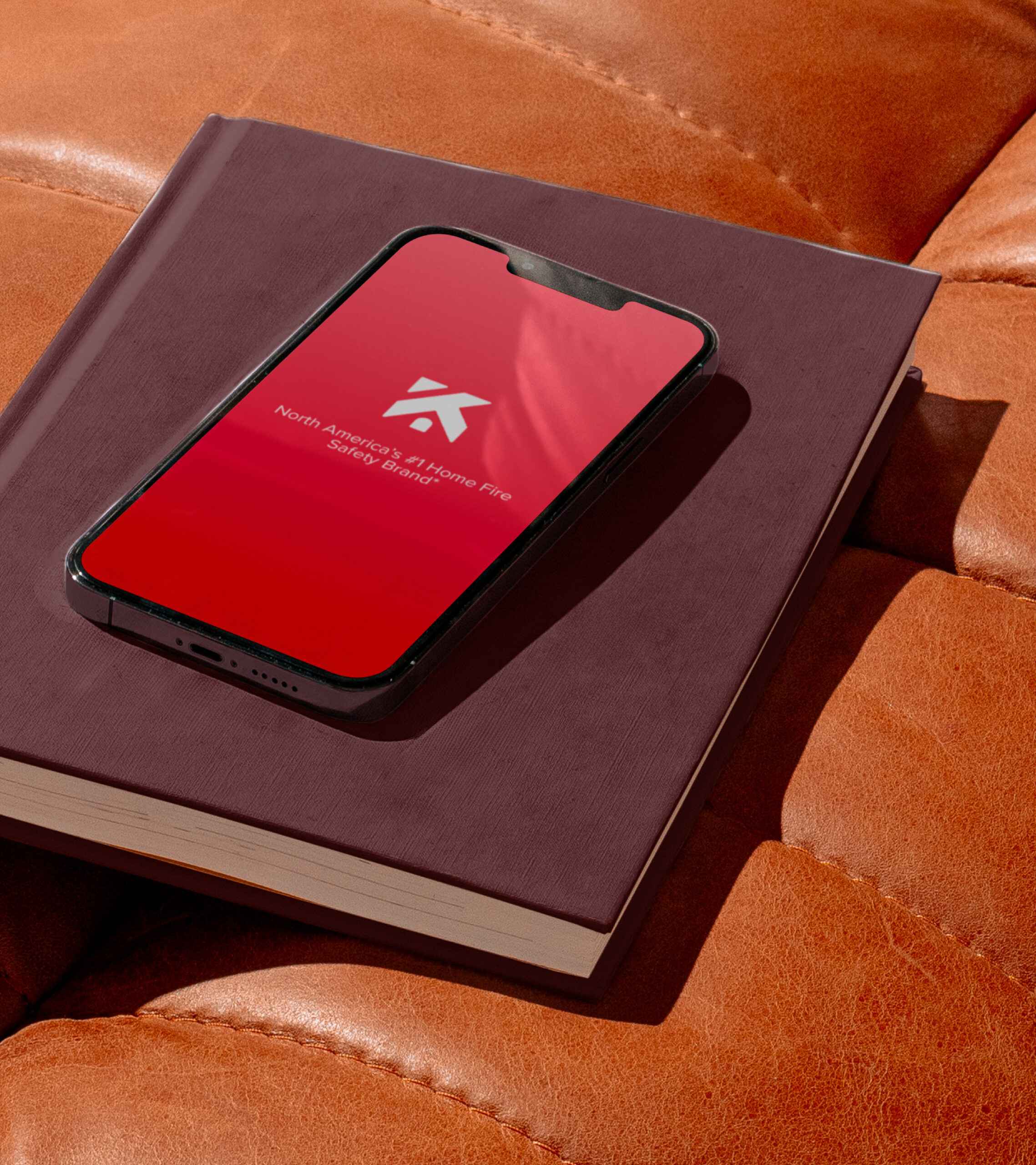
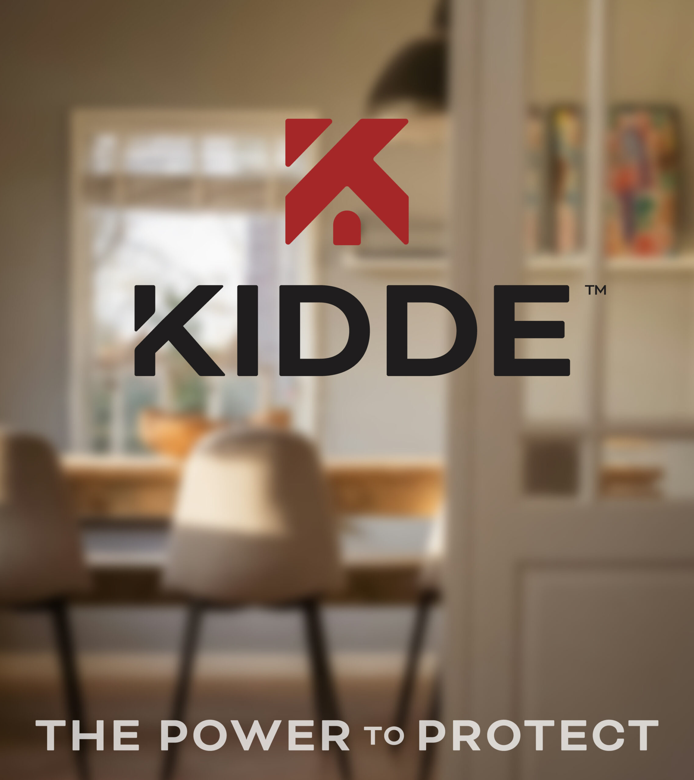
The visual identity for Carrier brand’s Kidde — the leading manufacturer of fire safety products — embodies the brand’s core mission of protection.
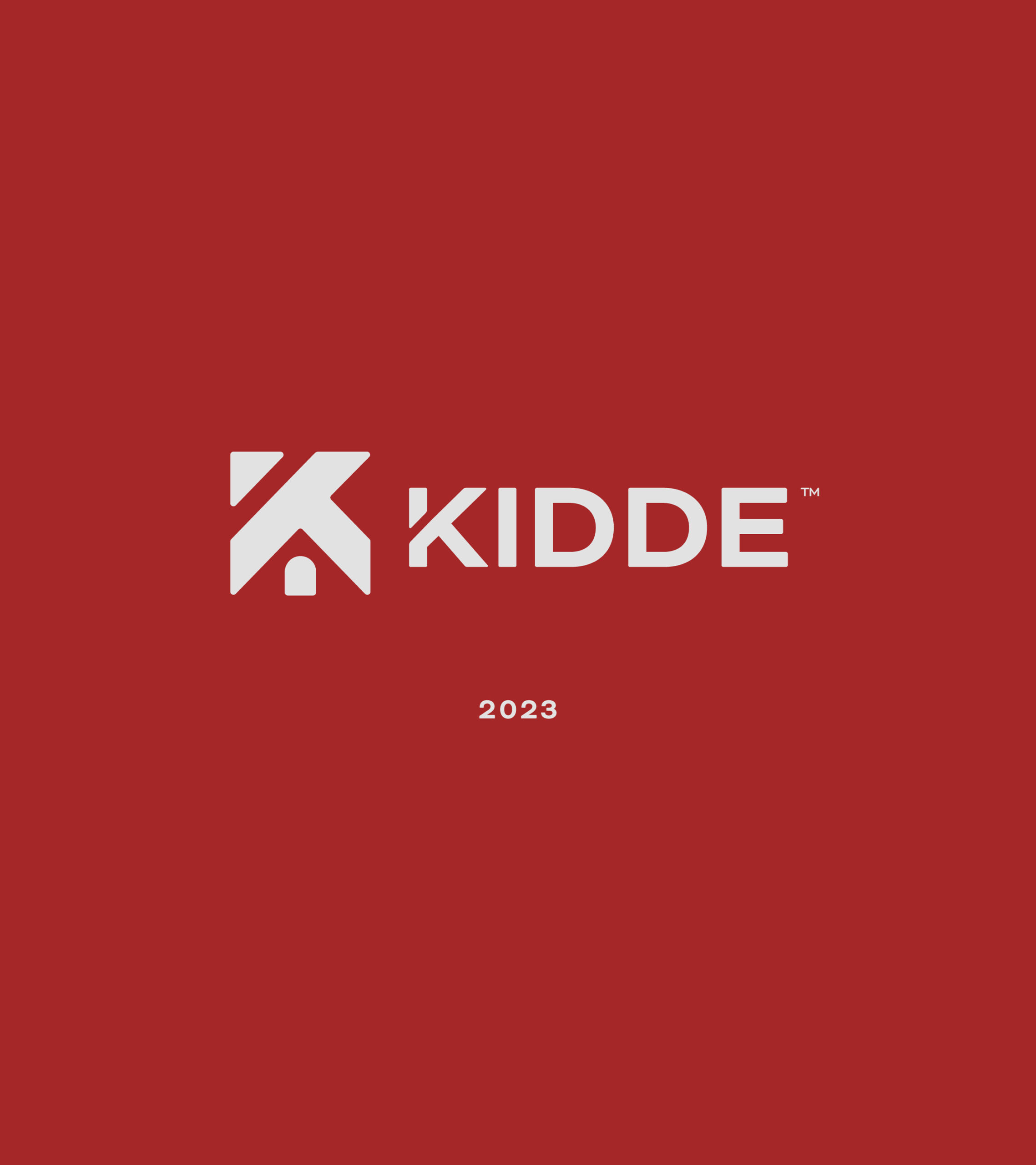
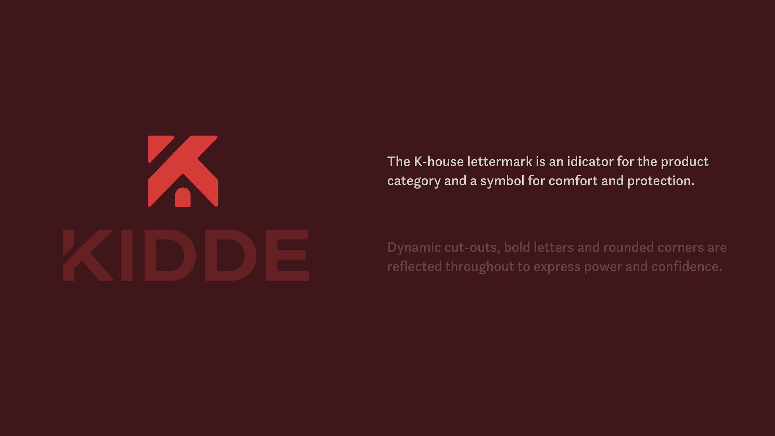
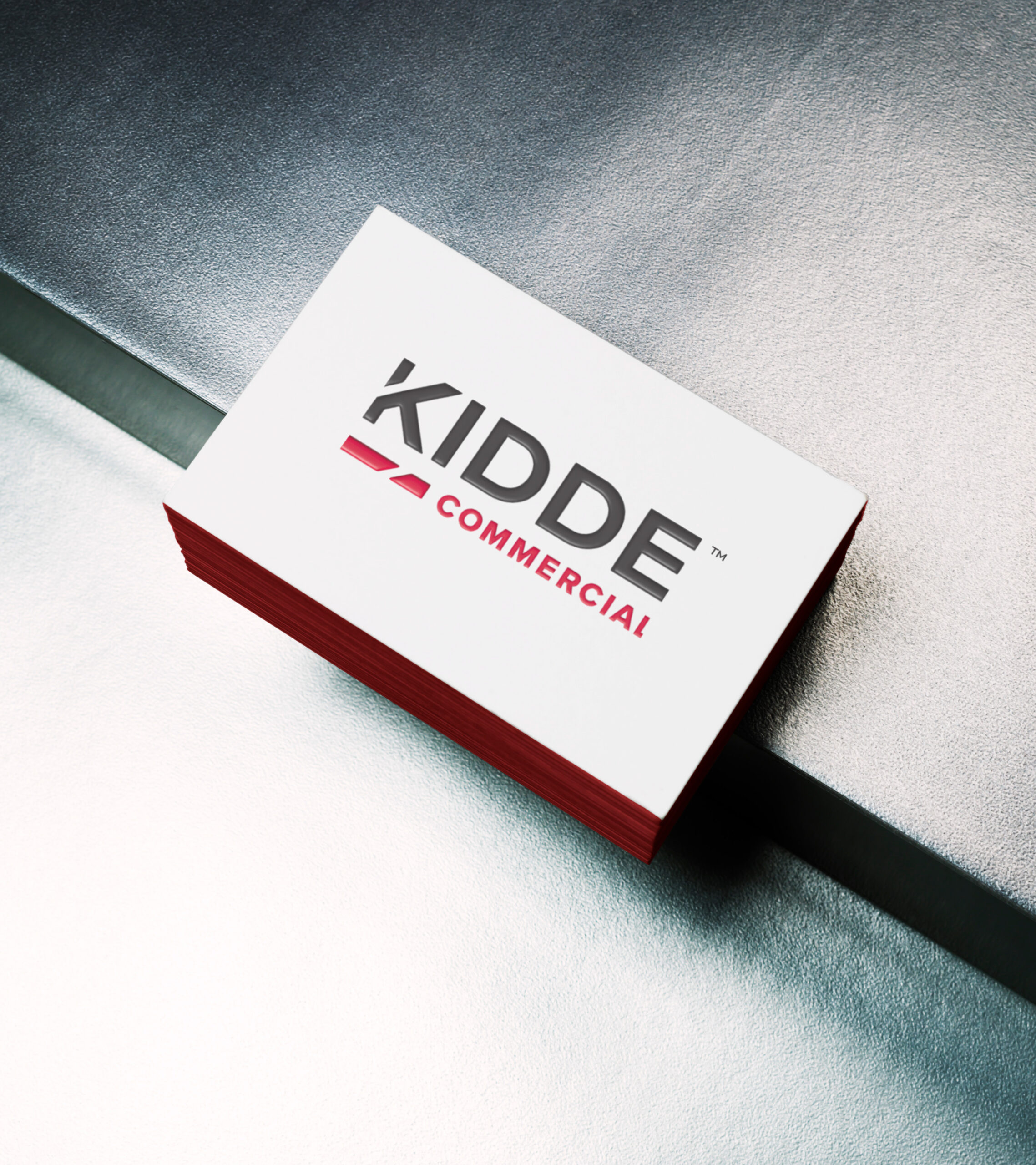
The lettermark merges a bold “K” with a house, symbolizing safety and home security. Rounded corners convey trust and familiarity, while dynamic angles represent innovation, urgency, and forward-thinking.
The customized wordmark echoes the elements within the lettermark, making it an identifiable standalone brand element, while the refreshed color palette of reds and neutral tones reinforces reliability and premium quality.
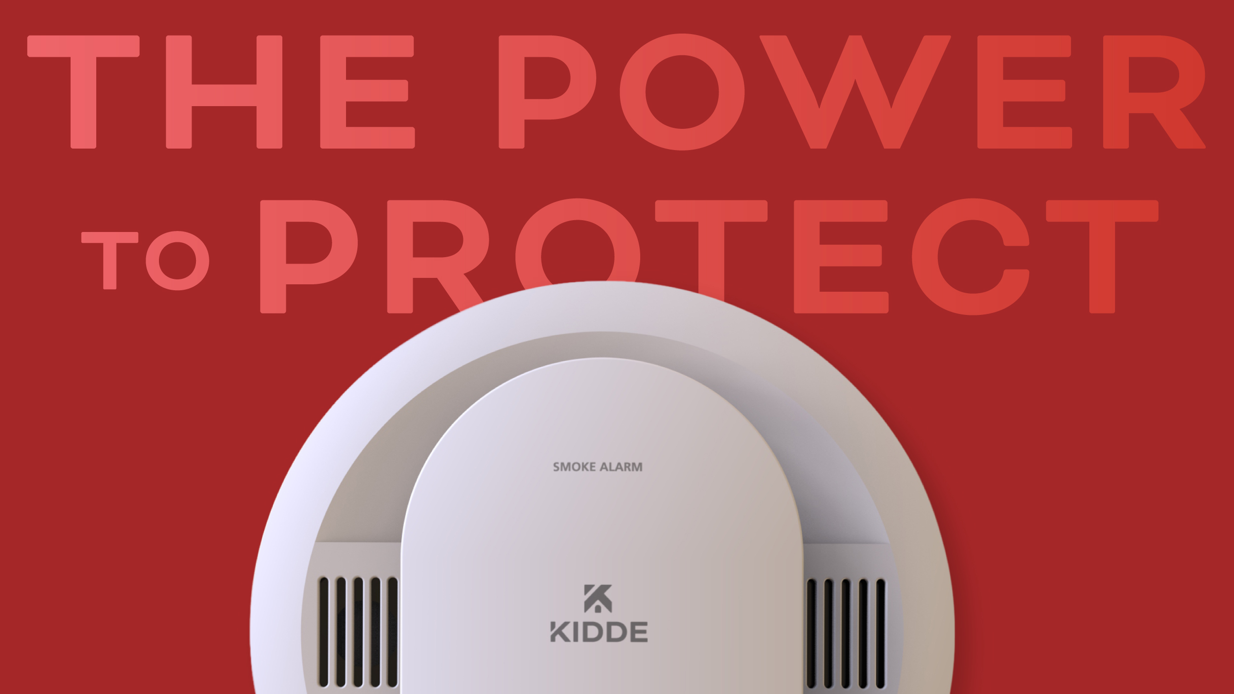
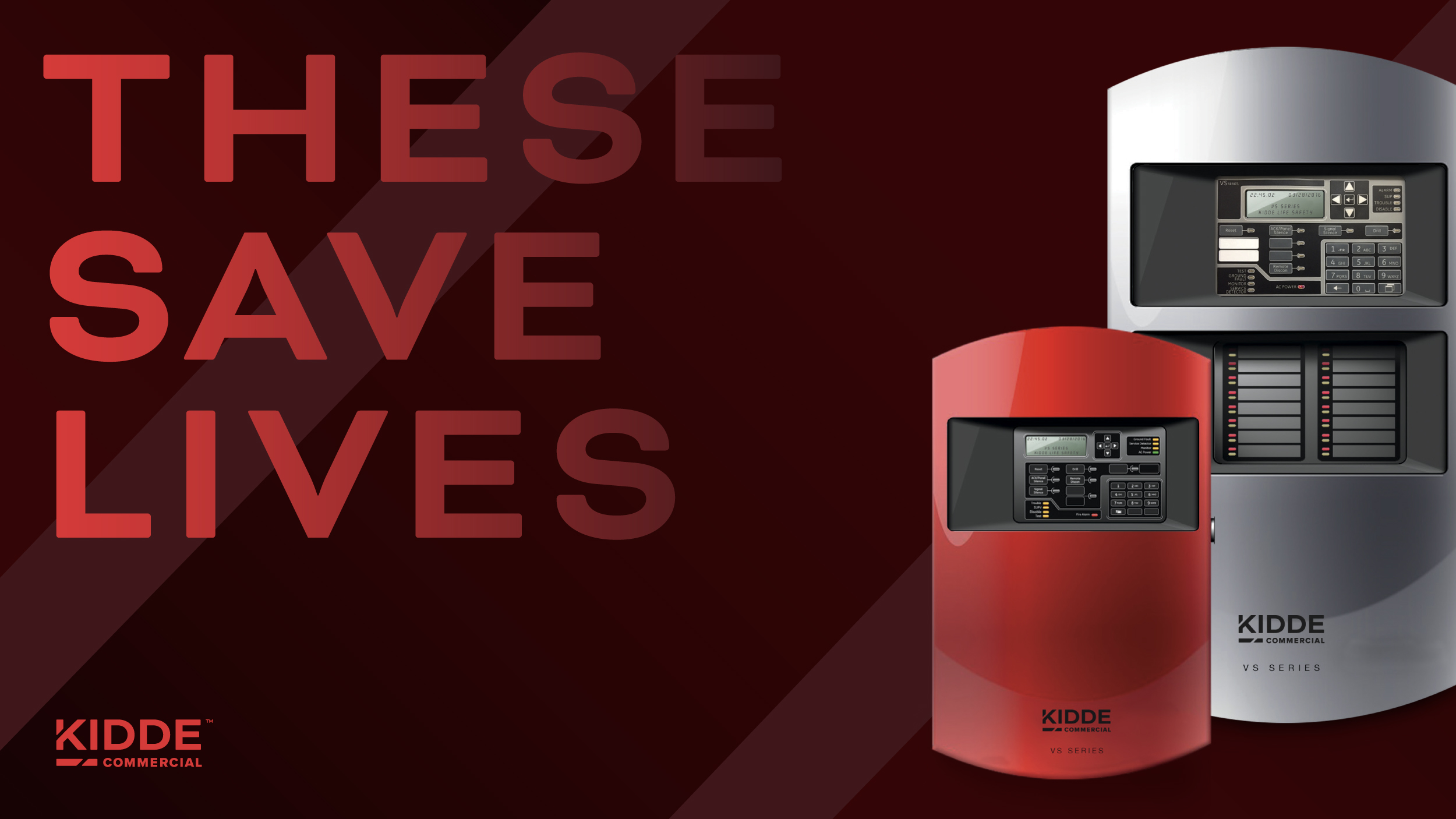
Expanding from residential products on Home Depot shelves into Kidde Commercial, the system extends Kidde’s trusted reputation into the commercial life safety space — seamlessly connecting brand identity with product excellence.